01 Nov 11+ Bold Typography Poster Examples, Templates & Ideas – Daily Design Inspiration #30
Posted at 17:26hin Daily Design Inspiration, Poster InspirationbyRyan McCready
25 Likes
Every hour there are thousands of projects published by many talented designers. But because those arepublished across a collection of different social networks and sites, you often miss them.
That’s why I decided to put togetherthe firstedition of the Daily Design Inspiration, and now we are on number30! With this daily collection oftypography poster examples, Iwant to give new designers a platform to show off their work.
To spread some inspiration to readers. To collect amazing design workon one platform. And to make iteasy for anyone to create something beautiful.
So let’s get started!
In this edition of theDaily Design Inspiration, we are going to look at somebold typographicposters fromBureau Borsche,Tim Tijink,and a few from our own Venngage designers.
Now if you want to learn more about creating your ownposters from scratch, start withthis article:
Also be sure to check out yesterday’s Daily Design Inspiration, where we covered somecreative marketing brochureexamples!
1.Made of Two Minimalist Typography Poster Collection


Creator:Giuseppe Fierro
Type:Creative Typography Poster Example
The typography poster template above shows multiple examples of how you can get your point across through minimalist designs. Scrolling through each example, the negative space in each poster design helps the reader focus directly on the message. There are no images present, only bold text against solid backgrounds; minimizing any distractions.
Across the typography poster template, the designer has provided examples where the message reflects in the typography design itself, and some without. Each one is just as effective and gets the message across. For example, looking at the first one mentioning time, the words “No Time” reminds me of an hourglass; one is the time that has passed, and another that is in the present. The shade of the top part is more vibrant and represents current time, matching not only the color of the rest of the message but going along with the overall message itself!
2. Simple BlueJob Expo Event Poster Template


Creator:Venngage
Type:Business Typography Poster Example
Adding an opaque text box over background images makes your information more legible, just like this typography poster example. In this case, the designer used a maximum of two different font styles to distinguish the main details from supporting details. The heading is straightforward which accurately represents the event, and with the large bold font style, it pops to the readers’ eye.
Though the background consists of a vibrant color, it’s muted with the text box on top, yet still bringing color to life with the use of a simple line under the text. These minor details in your typography poster example can balance out designs and make it more visually appealing. This poster design is a great example of how multiple headings can be bolded to deliver different information.
3.Nike Bounce For DaysTypography Poster Example


Creator:
Type:Typography Product Poster Example
Nike never disappoints when it comes to their advertisem*nts, and this typography product poster is the perfect example. The ball, the athlete, and the shoes all play a part in the act of bouncing, and if it wasn’t clear from the image alone, the word “BOUNCE” sets you on the right path!
For your typography product poster, think of the key traits you want to promote and make sure your text style is reflective of that. This typography poster example has minimal text, but yet is more effective than the rest, all due to the design layout of the heading. Using white against a busy and vibrant background can place even more emphasis on the text.
The placement of each letter in different positions also makes the user experience a bounce, by simply reading the word. If that isn’t effective typography, I’m not sure what is.
4.Typography x Photography Poster Example Series
Creator:Tim Tijink
Type:Bold Typography Poster Examples
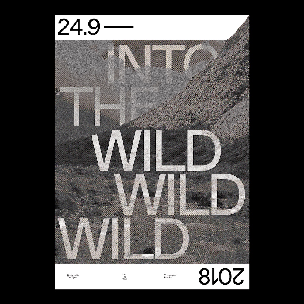
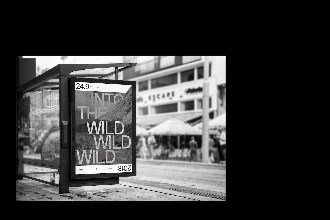
Here is another example of a bold typography poster where the text takes the user through a journey. In the first poster example, the different shading and alignment of each word create a sense of depth. The word “into” draws you to the wild, one word at a time, slowly sucking you in. The opacity in the text adds to the effect, as it lets you see through the image. Each “wild” has different brightness and texture, in a way reflecting how each experience can vary.
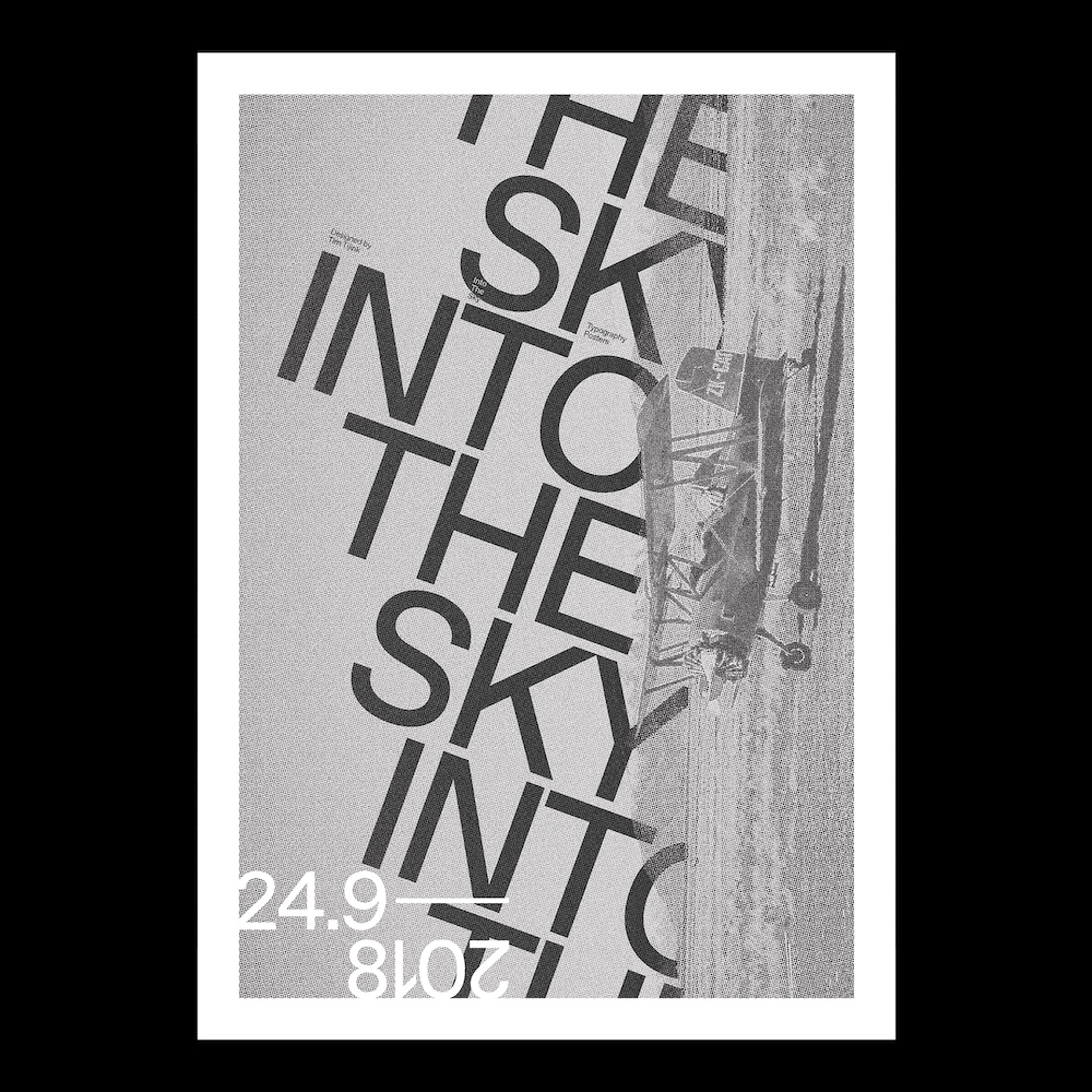
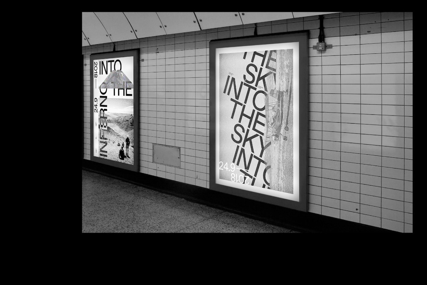
The next bold typography poster in this template creates direction into the sky; the same way airplanes take off and land. In this case, the designer initiated this feeling from the skewed text in respect to the airplane. Using imagery that reflects your message not only adds to the theme but also dismisses any confusion the reader may have.
5. Innovative Typography Centric Event Poster Example

Creator:Not Listed
Type:Simple Typography Poster Example
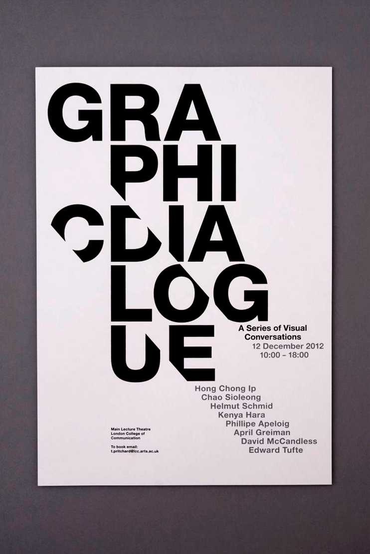
Visual conversations have no boundaries; they can be in any shape and form, just like this typography poster example. The composition and arrangement for the words above for are different than you would see anywhere else; intriguing the user instantly. Whether it’s placed in a light or dark setting, either way, the poster example catches the eye, all due to the typography.
In this typography poster example, consistency has created balance all along the page. Not only is this design unique in the way it has aligned the text, but even balanced diagonally, as compared to horizontal or vertical. If you want to use large bold text to get the message across, be mindful of the background setting, as it can really affect the effectiveness.
6.Urban Socks Marketing Typography Poster Example


Creator:Gianluca Santoro
Type:Typography Marketing Poster Example
Urban life can at times be loud and busy, right in your face with lots going on. Seems to be right along the lines of these typography marketing posters right? Add some noise, add some color to your life, and make it interesting.
At first, the grey background in one of the typography marketing posters reminded me of the textured grey pair of socks we all have, but taking a closer look, it even looks like the gravel in the streets. Looking at the red poster next, the black shape resembles a tie and makes me think of the brave souls who wear colorful socks under their serious suits; also bringing color to their life. Each element and composition is powerful, inspiring the reader, not only with the poster design but the context itself!
7.Google Font Trends Typography Poster Example

Creator:Abhishek Garg
Type:Typography Poster Example
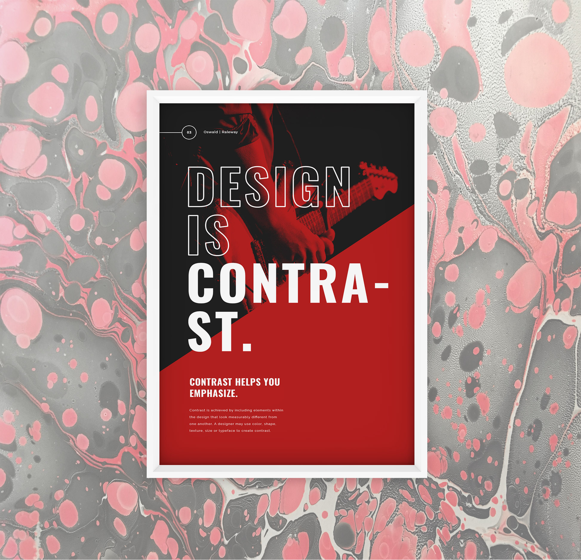
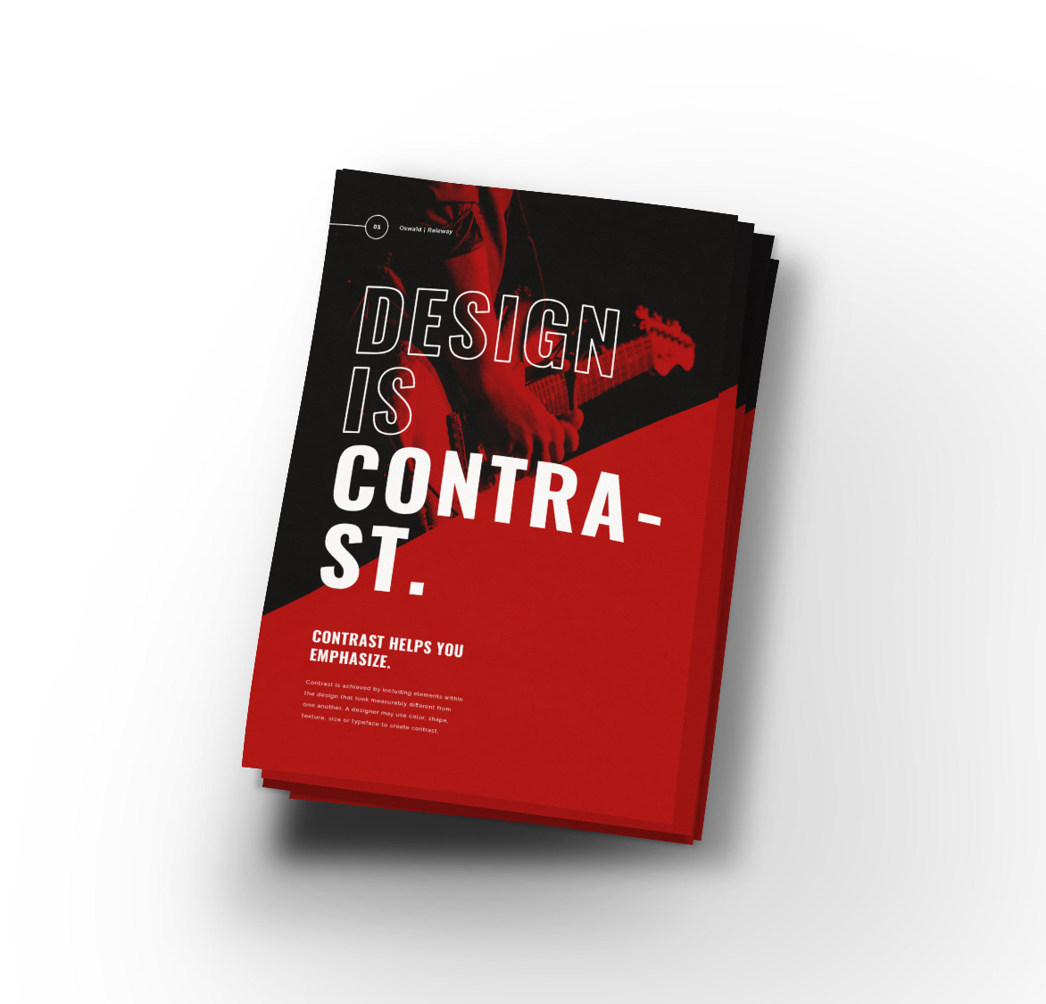
The designer for this informational typography template has done a tremendous job at teaching us the concept behind this message. Not only do you get to read the details for this message, but also you visually understand it from the first look.
When using multiple elements on a page, you have to incorporate contrast one way or another, otherwise, there would be low visibility as to what’s presented. In this case, we got two examples, one side against a solid colored background and the other against a background image. For both sections, we can easily read the text due to the color contrast in the text, no matter what the size.
Teaching by example always works, and this was definitely the case here. Use this informational typography template to send your message in ways a user can relate, as it makes it more effective.
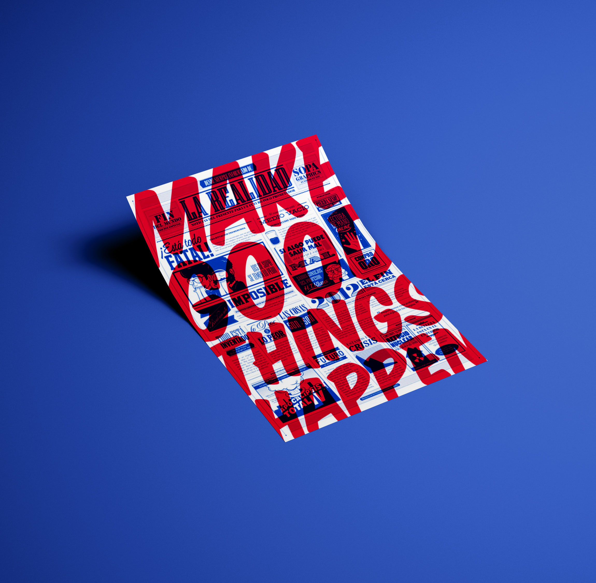
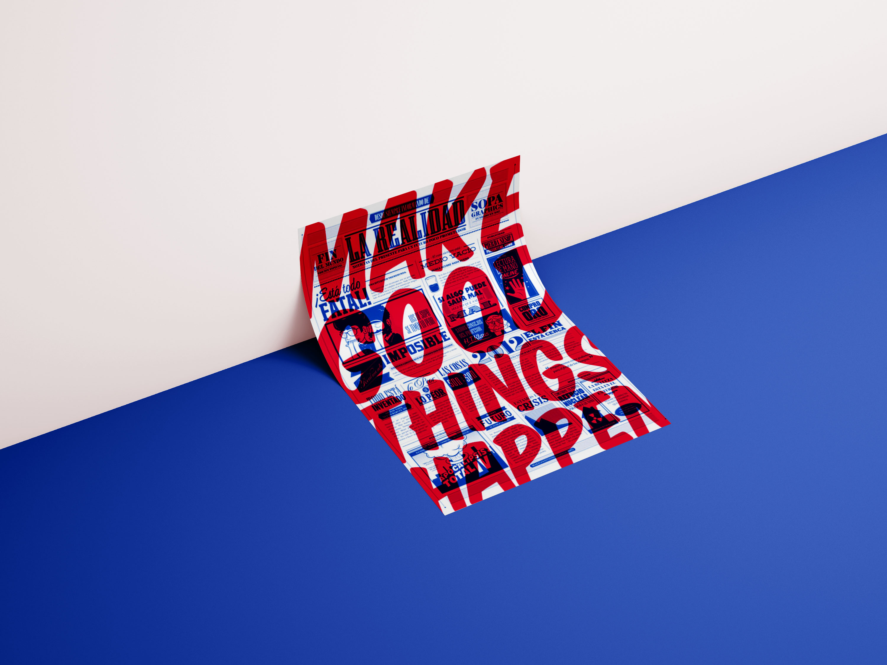
8.Make Good Things Happen Colorful Poster Example

Creator:Make Good Things Happen
Type:Colorful Typography Poster Example
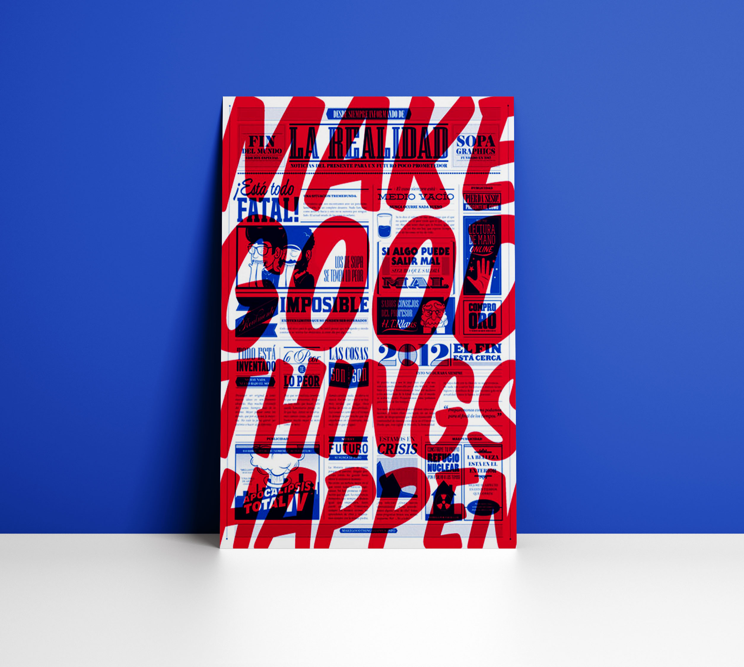
This seems like a busy typography poster example, but once you understand what it’s about, it doesn’t feel that way at all. If you focus on the message, your mind easily wanders to other topics it can relate to. However, the background image sets you on the right path and leads you to the intended purpose.
Large red text always catches my attention instantly and gives me a sense of urgency that I can’t ignore. In this case, with the inspirational message, using red was really the best choice. Even in bright, vibrant settings the red from this typography poster example easily stands out, drawing you in closer to see what it’s really about. If used properly, you can use noise to keep your audience interested, just make sure it doesn’t distract them to any other topics.
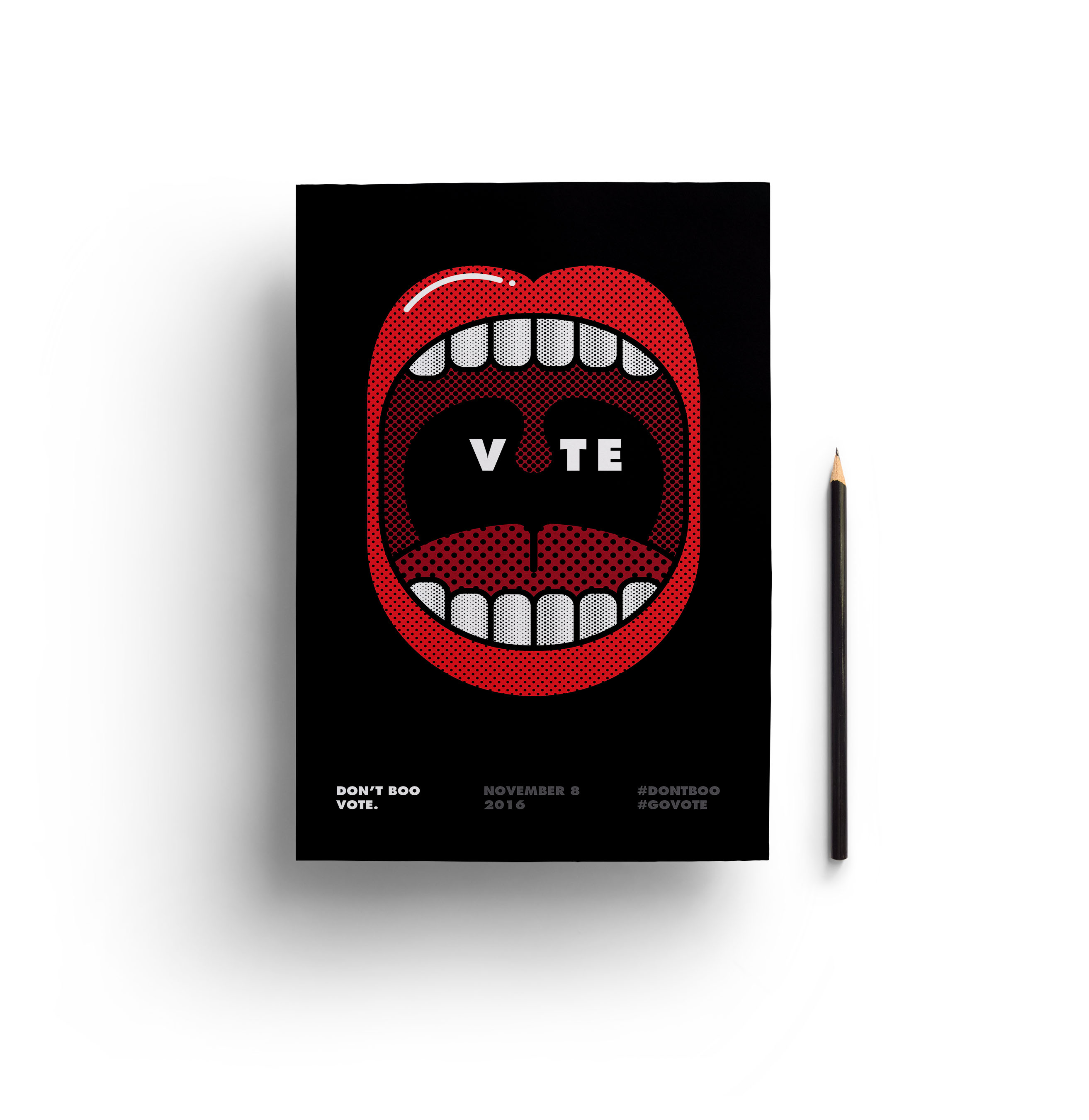
9.Go Vote Minimalist Poster Example


Creator:Viet Huynh
Type:Simple Typography Poster Example
Before reading any text, the mouth instantly makes me think it’s a loud typography poster design associated with music. When really it’s pushing you to make sure your voice is heard.
Over the years we’ve seen so many vote posters that we easily tune them out and barely give them a chance to look at. In this case, it kept my attention since I mistook it for the wrong kind, and once I corrected myself, it intrigued me even more. In a way, making it accessible to a wider audience, ones who get attracted to vote posters, and even the ones who are the exact opposite.
The text in this typography poster design is bold and easy to read, making it straight to the point. It doesn’t drown the audience in excessive information on how they should vote, it simply tells them to go do it.
10.Leica M-Monochrom Product Poster Example


Creator:Saatchi & Saatchi
Type:Creative Typography Product Poster Example
This typography product poster has effectively used font weight to bold certain letters and make them stand out against the monochrome design. Monochrome concepts can easily lose the audience, as it appears dull with no life to it. In this case, the bold camera and letters gave us something to focus on and get the message across.
The size of small text in this typography product poster can achieve two goals. Either it can use the small text to draw the reader in for a closer look, or it could simply be used as a background image to help align the more important, bolded text. Both ways it works and can enhance the user experience.
11.Red Dutone Now Hiring Typography Poster


Creator:Xavier Esclusa Trias
Type:Creative Typography Product Poster Example
I love the softness of this typography poster template, in comparison to the rest, it really stands out to me. When it comes to typography posters, you mostly see powerful designs to make the message more effective. However, in this case, the softness of the color, the negative space, and the minimalist design is what had a great impact. Even in comparison to hiring postings, this design gives a friendly vibe, attracting even the shyest of people.
Contrast is a consitent theme that you have seen throughout this article, just like this typography poster template. The designer used to contrast with the color of the text, and with the white border, both contrasting with not just the background but with each other as well. This is a great example that shows you can use soft color palettes to get your message across; it doesn’t always have to pop to the eye.
Now if you want to learn more about creating your own poster I would recommend checking out these articles:
The Ultimate Poster Design Guide: 80+ Design Tips and Templates for Every Occasion
Or check outanother collection of Typography Posters below: